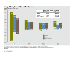
It doesn’t.
The chart is designed to address the issue of risk by showing that it’s time, not timing, that reduces risk for the investor. After all, as you can see, a 50-50 stock and bond portfolio might go down 15% if held over one year; but, should expect a ‘downside’ risk of +5% if held twenty years.
While it may be true that the volatility of long-term outcomes may be reduced, it actually means little in the real world.
Patrick Kelly, in his book The Retirement Miracle, talks about the story of Tom who had been contributing to his 401(k) plan for years, riding the market ups and downs, and finally feeling good about the $2.5 million he’d accumulated in November, 2007 on his 64th birthday as he looked forward to retiring the following year.
On the day he planned to retire in November 2008, he walked into the office finding a lot of commotion. During the next three days his $2.5 million was at $2.2 million. By October 7th, it was down to $1.5 million – down about $1 million in 12 months. His dreams of traveling with his wife had gone up in smoke.
The chart above didn’t let him know that when you’re one year away from retirement, you aren’t looking at the 20-year data anymore; it’s the one-year data that may be more relevant.
Now, obviously, the 2008 market meltdown was an extremely rare occurrence, and one arguably caused as much by (and that’s being generous) elected officials as anything Wall Street did; but, the lesson is no less worth learning: Managing the downside becomes critical as time passes and we get closer to the time we begin to draw-down on assets.
‘Nuff said.
You can begin your planning here! Let me know if I can help.
Jim


